One of the best ways to make your data visualization work stand out is by breaking away from your tool’s default color scheme. This also has the benefit of making your work more accessible to users with color blindness, as many default palettes aren’t designed for users with visual issues. Your boss may be open to the idea, but (understandably) doesn’t want you to just start tinkering with your products. The solution is to make mockups of possible new palettes first. Then, you and your manager can decide if any of them are better than your current colors. Fortunately, the tidyverse makes it fast to generate proofs of concept for several color options.
Baseline plots
We want plots we can use to show off how different color palettes handle both continuous and discrete data. A bar chart and a scatter plot seem like good ways to do that.
library(tidyverse)
library(scico)
library(patchwork) # to put both plots in the same image

theme_set(theme_minimal())
bar_chart <- ggplot(diamonds, aes(cut, fill = cut)) +
geom_bar() +
coord_flip() +
# fill guide would just duplicate x-axis label and take up space
guides(fill = FALSE) +
labs(x = "Cut", y = "# of diamonds")
bar_chart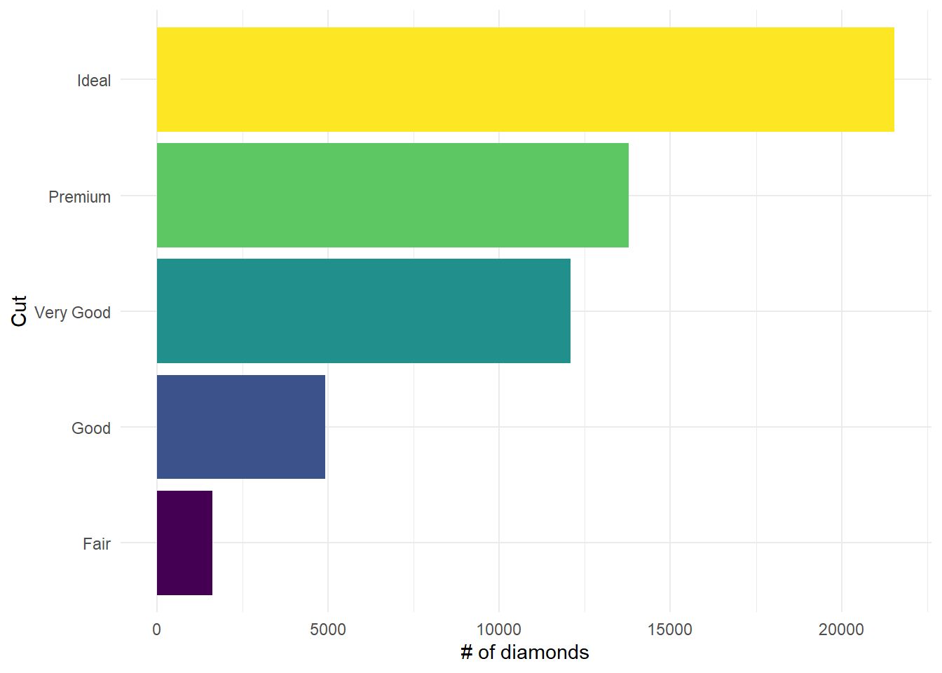
scatter_plot <- ggplot(txhousing, aes(listings, sales, color = median)) +
  geom_point() +
  labs(x = "Monthly listings in county",
       y = "# of sales",
       color = "Median sale price")

scatter_plot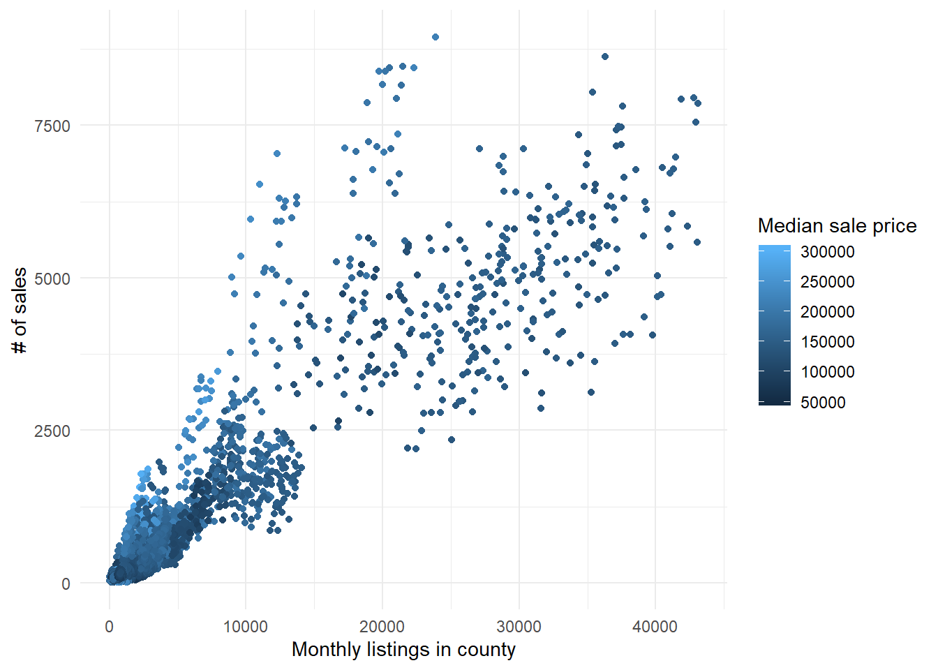
Palettes
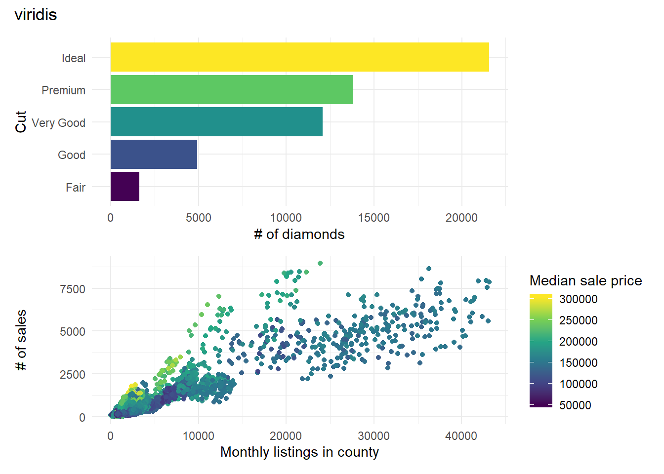
We’re going to use a few palettes from
viridis
(now part of ggplot2) and
scico.
Both packages prioritize palettes that are friendly to users with
colorblindness and read well. Since this is for presenting to a higher-up, I’ve
already narrowed it down to two or three palettes from each package. I picked ones
that I thought might be appealing and are fairly different from each other. I
encourage you to check out both packages to see if any of the other palettes
seem more promising for your needs.
viridis_palettes <- c("plasma", "viridis")
# codes for plasma and viridis
viridis_pal_codes <- c("C", "D")
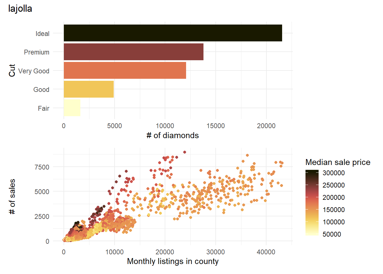
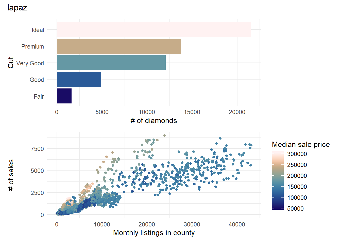
scico_palettes <- c("devon", "lajolla", "lapaz")We’re using a pair of vectors for viridis but not for scico
because ggplot2 uses letter codes to identify viridis palettes (e.g. "C" for
plasma). However, we want to also have the palette name so that it can be
used in plot titles and file names. If your manager says, “I really liked
palette”B“; Let’s use that one”, you don’t want to be stuck scrambling to
remember if it was “magma” or “inferno”. scico just uses the name of the
palette, so a vector of names is enough.
Creating the Proofs of Concept
Since we’re repeating the same core process (building a pair of plots) with
minor tweaks (using a different color palette), we should write a function
that we can re-run with a new parameter for each palette. Adding a
palette from viridis is different enough from adding one from scico that
we’ll actually want two functions, one for each package. However, both have the
same core steps:
1. Add the palette to the baseline plots.
2. Combine the two plots into one with patchwork and add the
name of the palette as a title.
3. Print out the new plot for review.
4. (Optional) Save the plot for later. I’m assuming that you’re using a
project-oriented workflow
to manage your plot files.
build_vir_poc <- function(vir_pal_name, vir_pal_code, save_plot = FALSE){

# use the letter code part of the vector for the scale function
vir_bar <- bar_chart + scale_fill_viridis_d(option = vir_pal_code)

vir_scatter <- scatter_plot + scale_color_viridis_c(option = vir_pal_code)

# use the name part for the title
vir_patch <-  vir_bar/ vir_scatter +
  plot_annotation(title = vir_pal_name)

print(vir_patch)

if (save_plot == TRUE){
  ggsave(filename = here::here(paste0("figs/", vir_pal_name, ".jpg")),
       plot = vir_patch)
}
}
build_scico_poc <- function(scico_pal, save_plot = FALSE){
scico_bar <- bar_chart + scale_fill_scico_d(palette = scico_pal)
scico_scatter <- scatter_plot + scale_color_scico(palette = scico_pal)
scico_patch <- scico_bar/ scico_scatter +
plot_annotation(title = scico_pal)
print(scico_patch)
if (save_plot == TRUE){
ggsave(filename = here::here(paste0("figs/", scico_pal, ".jpg")),
plot = scico_patch)
}
}Scale up with purrr::walk()
To generate all those plots, we need to iterate the functions over our palettes.
We could do this with a for loop, but we can simplify things with
purrr::walk(). walk is version of
(purrr::map())[https://jennybc.github.io/purrr-tutorial/ls01_map-name-position-shortcuts.html]
that is designed for functions where we care about the side effects (e.g.
creating a plot, writing to a file) instead of a traditional return value (e.g.
the square root of an input). For build_vir_poc, we use a variant of walk():
walk2(). walk2 iterates over a pair of vectors for when you have two
parameters that you want to change. This is similar to a loop for (i in 1:n){...} where you use i multiple times inside of {...}.
walk2(viridis_palettes, viridis_pal_codes, build_vir_poc)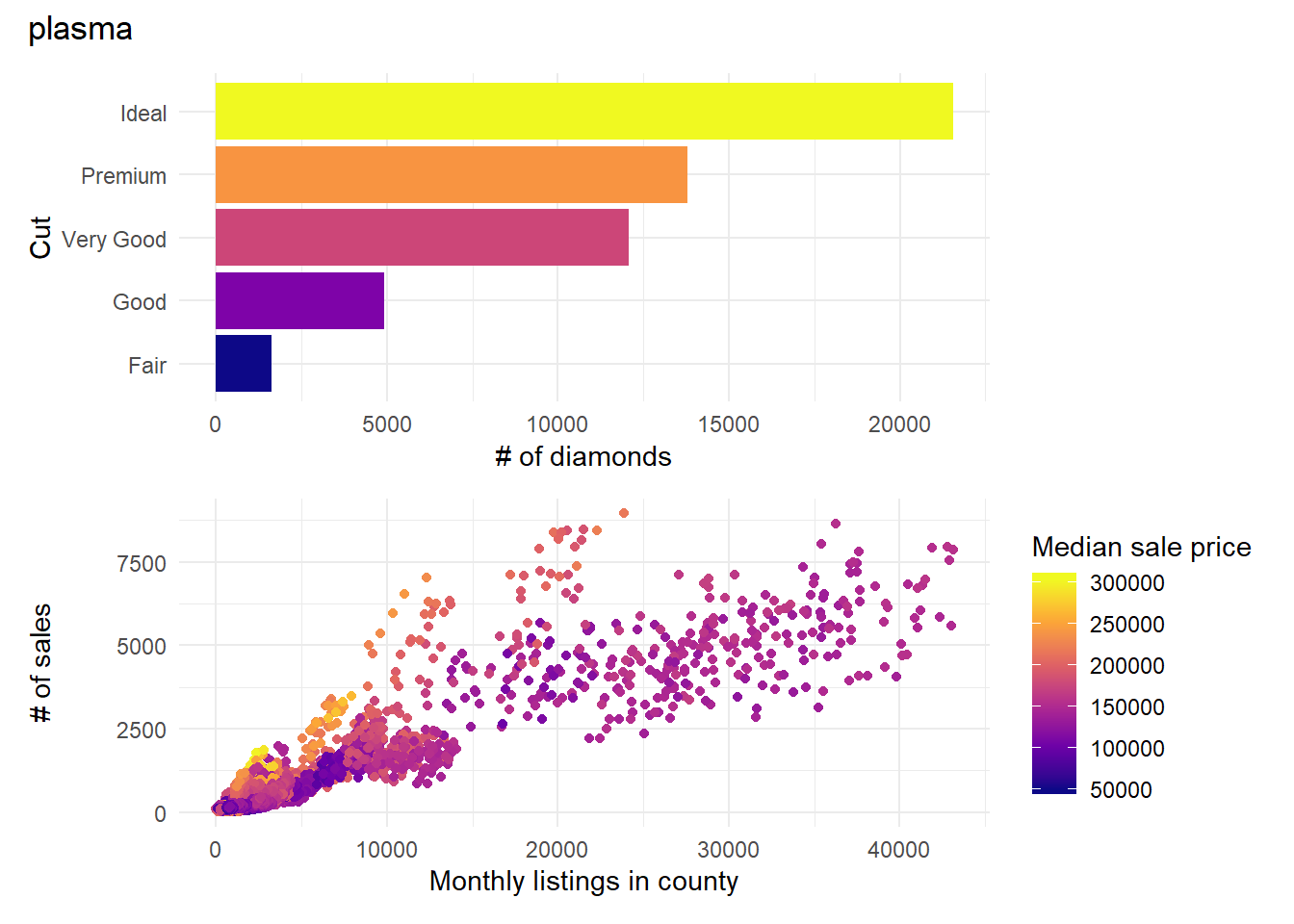
walk(scico_palettes, build_scico_poc)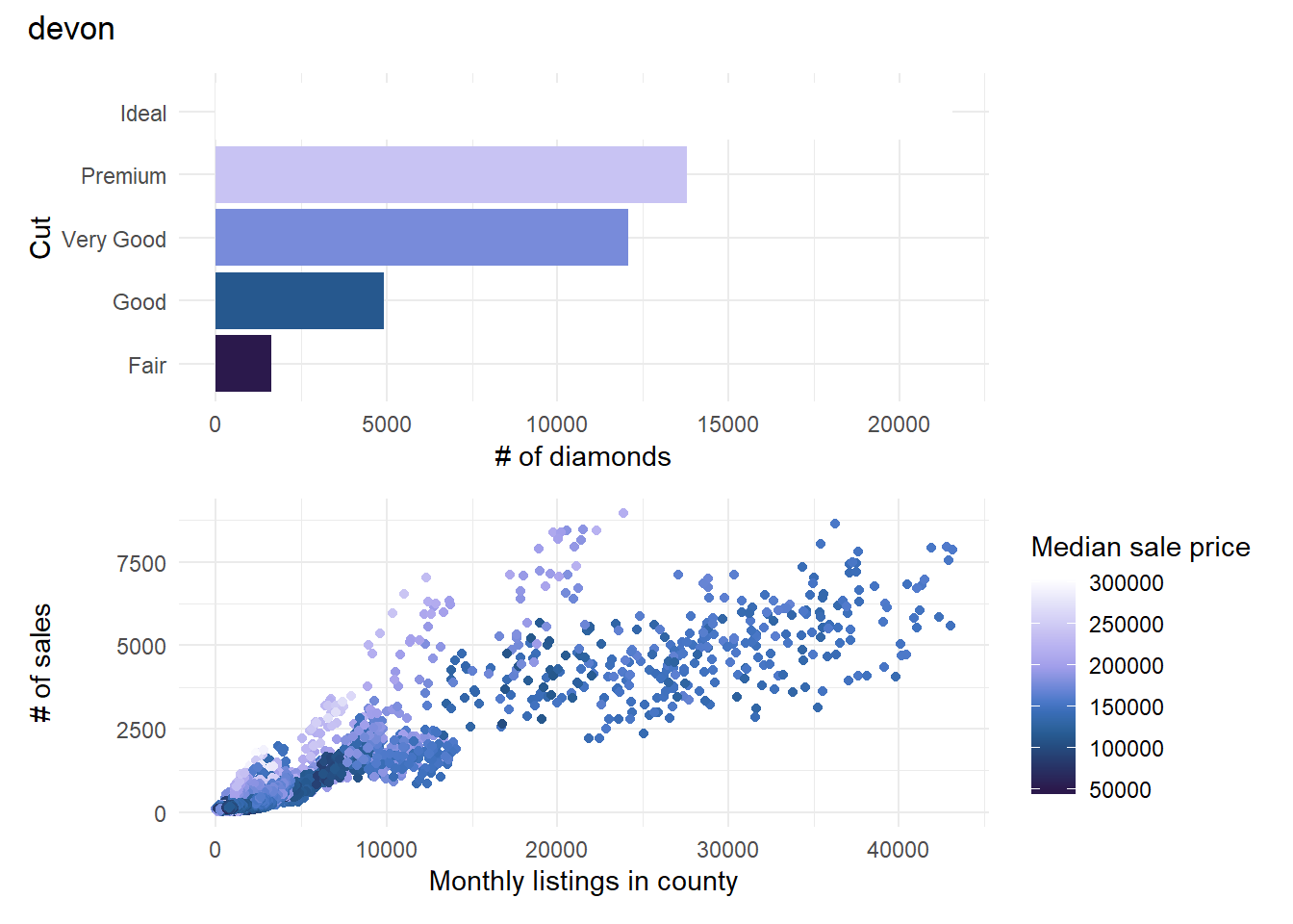
Conclusion
While I like the devon colors, the fact it leads to a white bar on a white
background is a deal breaker. It’s an easy first cut. Otherwise, this is a good
starting point for thinking about alternatives to default colors.
Once you’ve selected your color palettes, if you need to import them into
another visualization tool, both viridis and scico make that
straightforward.
# print 20 rgb codes for each palette
# plasma
viridisLite::viridis(20, option = "C")
## [1] "#0D0887FF" "#2D0594FF" "#44039EFF" "#5901A5FF" "#6F00A8FF" "#8305A7FF"
## [7] "#9512A1FF" "#A72197FF" "#B6308BFF" "#C5407EFF" "#D14E72FF" "#DD5E66FF"
## [13] "#E76E5BFF" "#EF7F4FFF" "#F79044FF" "#FBA238FF" "#FEB72DFF" "#FDCB26FF"
## [19] "#F7E225FF" "#F0F921FF"# lapaz
scico(20, palette = "lapaz")## [1] "#190C65" "#1D1F71" "#20307D" "#244089" "#284F92" "#2D5F9B" "#336DA0"
## [8] "#3C7AA4" "#4A88A6" "#5B93A6" "#709CA2" "#85A29B" "#99A593" "#ACA68C"
## [15] "#C0A989" "#D9B490" "#F0C5A6" "#FCD6C1" "#FFE4DA" "#FFF2F2"